You have a well-optimized website and assume that’s the end of the story? You think you’re finished with the coding, and now you can sit back and wait for the money? Sorry, but running an online business it’s not that easy. You must constantly work on improving it. And creating different landing pages for your products and services is one thing that can benefit your company.
What’s a landing page, you ask? Well, grab your cup of coffee and sit back while I explain it to you. ☕ A landing page is a location where all of the planes land. 🛬 Just kidding! 😄 I know it’s been a few weeks since April Fool’s Day, but I’m still in a silly mood. 🤪 Okay, I’ll get serious now.
What Is a Landing Page?
A landing page is a page that is separate from the website. It is designed for a particular purpose (usually for marketing) and may be used for various goals, such as collecting contact information or selling a specific product or service. A landing page has the power of converting visitors into leads or even customers. Beneath, we will go through some tips to keep in mind when creating a landing page. Any business can apply these guidelines, not just reseller hosting companies.
💡 Focus on your copy. Bear in mind that even though you ask “just” for an email, you must always provide something in return. Always make a unique value proposition. Offer something that can solve a real problem that your visitors are struggling with. Describe why and how you can solve their problem and try to convince them to opt-in.
💡 Keep it simple. Avoid cluttering the page and try using a minimalistic design. Use attractive aesthetics in conjunction with a clean UI. By keeping it simple, you’re letting your visitors focus more on the crucial elements like the headline or CTA (call-to-action button).
💡 Avoid navigation menu. This is part of the process of keeping things simple. The navigation menu can cause visitors to slip away from your landing page, so avoid using one. It would be best if you avoid any distractions. Again, this is not your official website; it is a landing page with a particular purpose.
💡 Proofread everything. Check your landing page as many times as necessary to ensure that all is perfect. You need everything to be flawless because even a minor typo can deter people from converting.
Essentials of a High-Converting Landing Page
Here are 6 must-haves on your landing page:
- Headline
- Subheading
- CTA Button
- Visuals
- Social proof
- CTA Button
Which of the above should be included in a single landing page? Everything! And, no, I did not make a typo! It’s a smart idea to have two call-to-action buttons on your landing page, but more on that later. Let us begin with the headline.
Headline
When someone lands on your page, the headline will most likely be the first thing they see, and you don’t want it to be the last.
JFYI While eight out of ten people will read your headline, only two out of ten will read the rest of your landing page.
Thus, make a catchy headline that will instantly grab the attention of the visitor.
As you might be aware, the average human attention span is very short, and you don’t have much time to capture it. Always aim to be concise with your message and to create enticing headlines using just a few words.

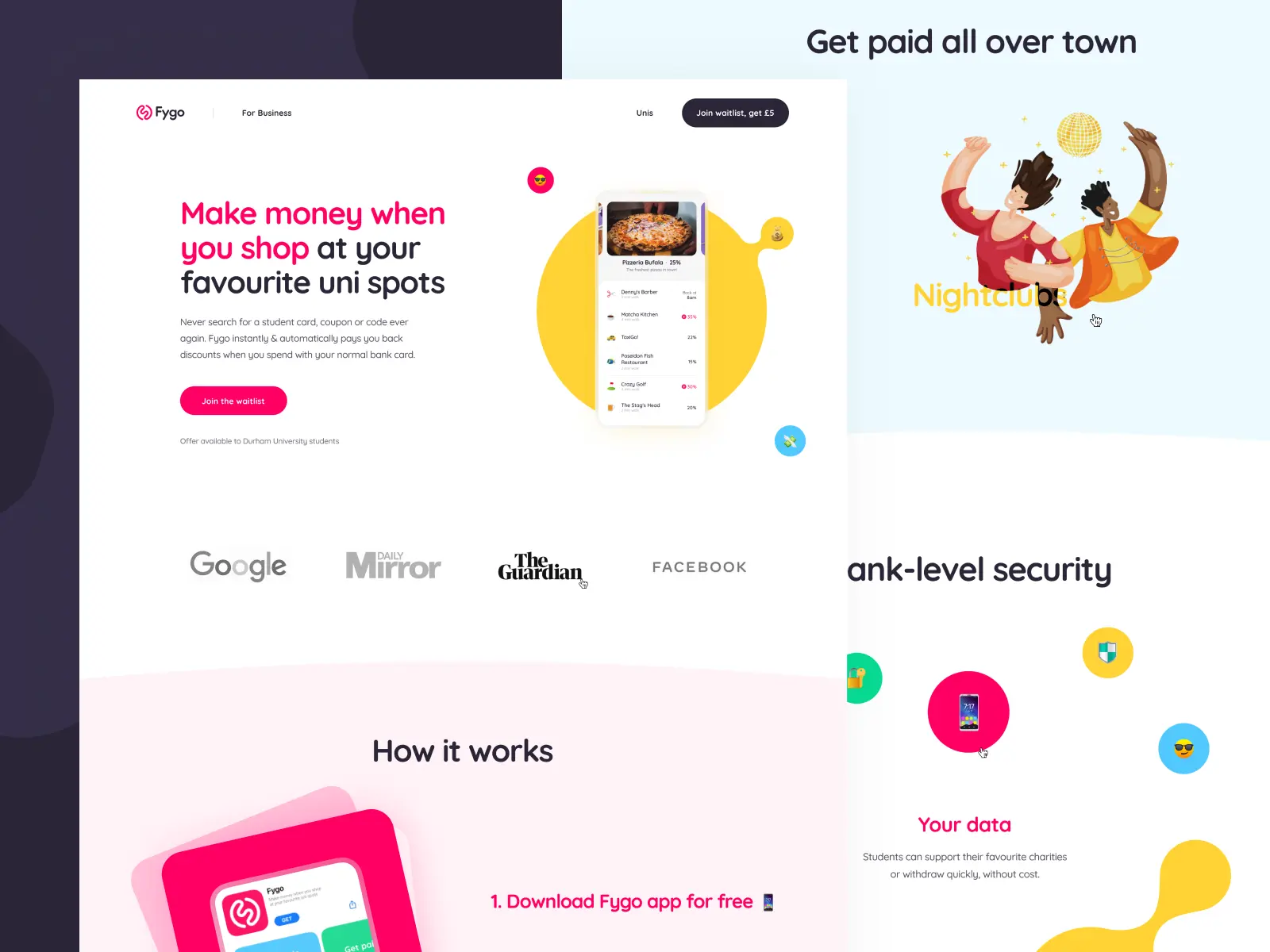
Fygo Landing Page by Cuberto via Dribbble
Subheading
The rules that apply in the previous section should also apply here. You just have a few seconds to make a successful first impression, so make it count. While the subheading should complement the headline and clarify the purpose of the landing page, it should not be too long.
CTA Button
Do you remember the adage “don’t judge a book by its cover”? Well, we all judge a book by its cover, and we also judge a CTA button by its copy. Hence you must write a compelling button copy. Please never use the phrase “Click Here”. You need to make it appealing for people to click on it. Also, choose a style that stands out from the rest of the page.
It’s also a good idea to have at least two CTA buttons, one above and one below the fold. This way, if they skip the first one, they can still click on the second CTA button.

Spark Landing Page by Vladimir Gruev via Dribbble
Visuals
You can use visuals like photos, illustrations, or videos. If you offer a free e-book, you can include the book’s cover. Alternatively, you may use a picture or a video of your product so that visitors can clearly see what you’re selling. Even if the product is still in development, you can use a concept picture or prototype as a visual. Well, who doesn’t appreciate a stunning picture?
Social Proof
Before making their purchase decision, more and more people nowadays rely on the experiences of others. So, it’s good to use social proof on your landing page, both above and below the fold.
In the upper section (above the fold), it is best to use something simple, such as a star rating, the number of users, or the number of downloads of the application. And it’s a good idea to provide social evidence, such as testimonials or case studies, somewhere below the fold. You may also incorporate video testimonials or Google reviews.

Somneo Landing Page by Dmitrii Sverdliuk via Behance
Landing Page Best Practices for Reseller Hosting
- Add a customized experience by targeting a visitor with a specific set of needs, such as a blogger in need of WordPress hosting;
- For one landing page, choose just one type of web hosting, such as shared hosting or VPS, etc.;
- Make the pricing details straightforward and easy to understand, if they apply on a monthly or annual basis;
- Make it clear if you offer add-ons such as domains, and if so, is it a one-time offer;
- Reduce the number of distractions on your landing page;
- Use testimonials for the type of hosting that your landing page is about; do not use testimonials for dedicated servers if you offer shared hosting;
- Last but not least, use an enticing CTA button, like “Get my hosting now”!
And that’s it. Now, once you’ve completed all the steps above, you can sit back, relax and wait for your conversions. 💰


